@insaneinside, welcome and thank you so much! That looks really interesting, I will look into it. Also, thanks for letting me know the proper maths notation.
Indeed, you would have trouble producing an analytical solution for a in terms of b here! There may be a way to determine it numerically, but I doubt it would be possible (let alone a good idea!) to do so in a shader.
This wouldn't be in the shader though, but in the C# code - I'm trying to do the shader maths backwards in order to place a marker on the map within the game logic. As for the issue being solvable, it
should theoretically be possible seeing how every a only has one b, if you get me

Anyways, thanks a million, I'll take a closer look at your math
 Update 497
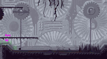
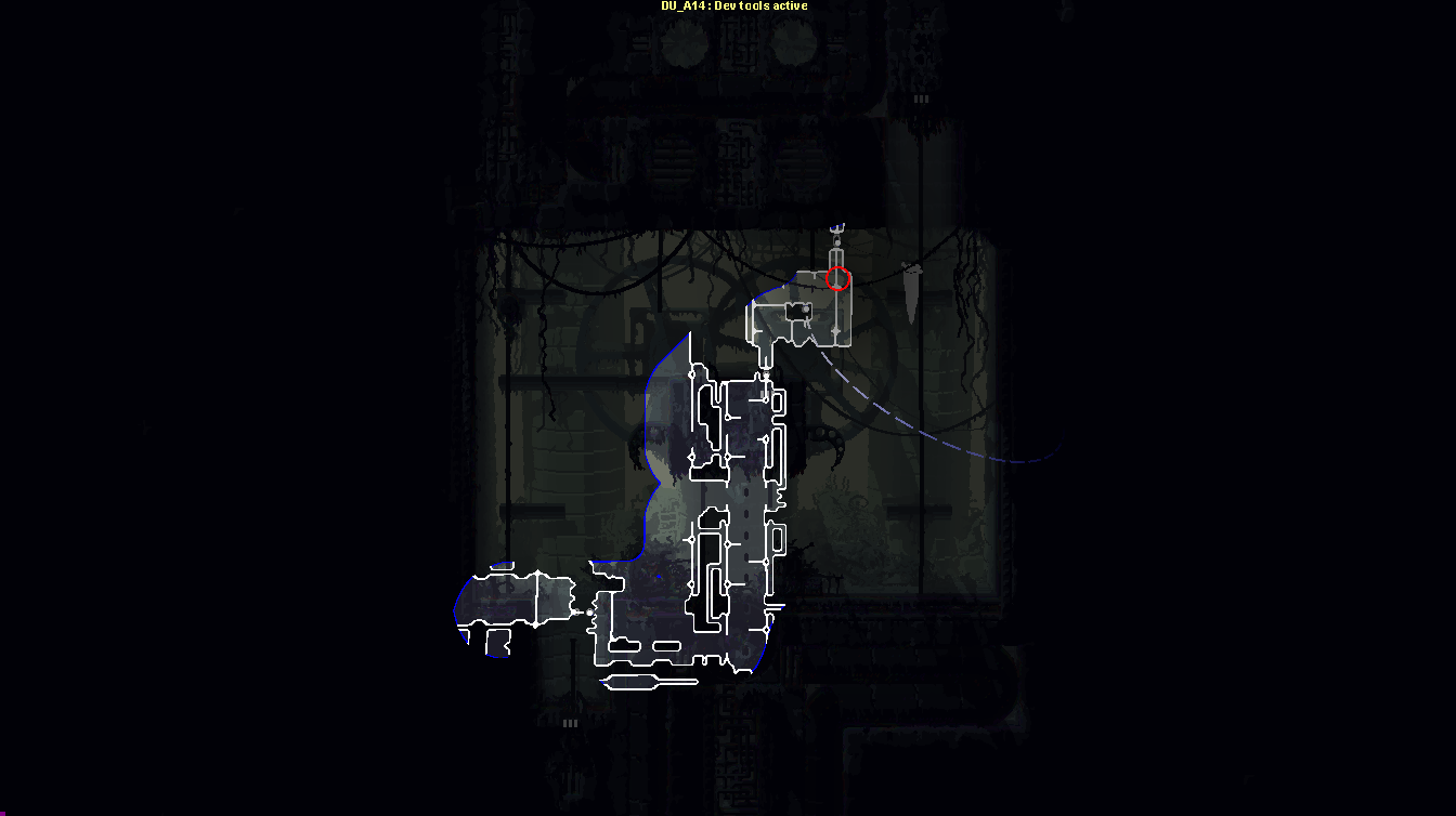
Fog of war and "slow reveal" animation for the map.
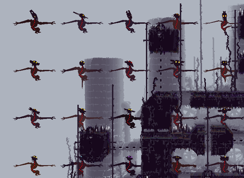
The fog of war is pretty straight forward. As you move through the world it draws to a texture, which is then used to determine what of the map to reveal.
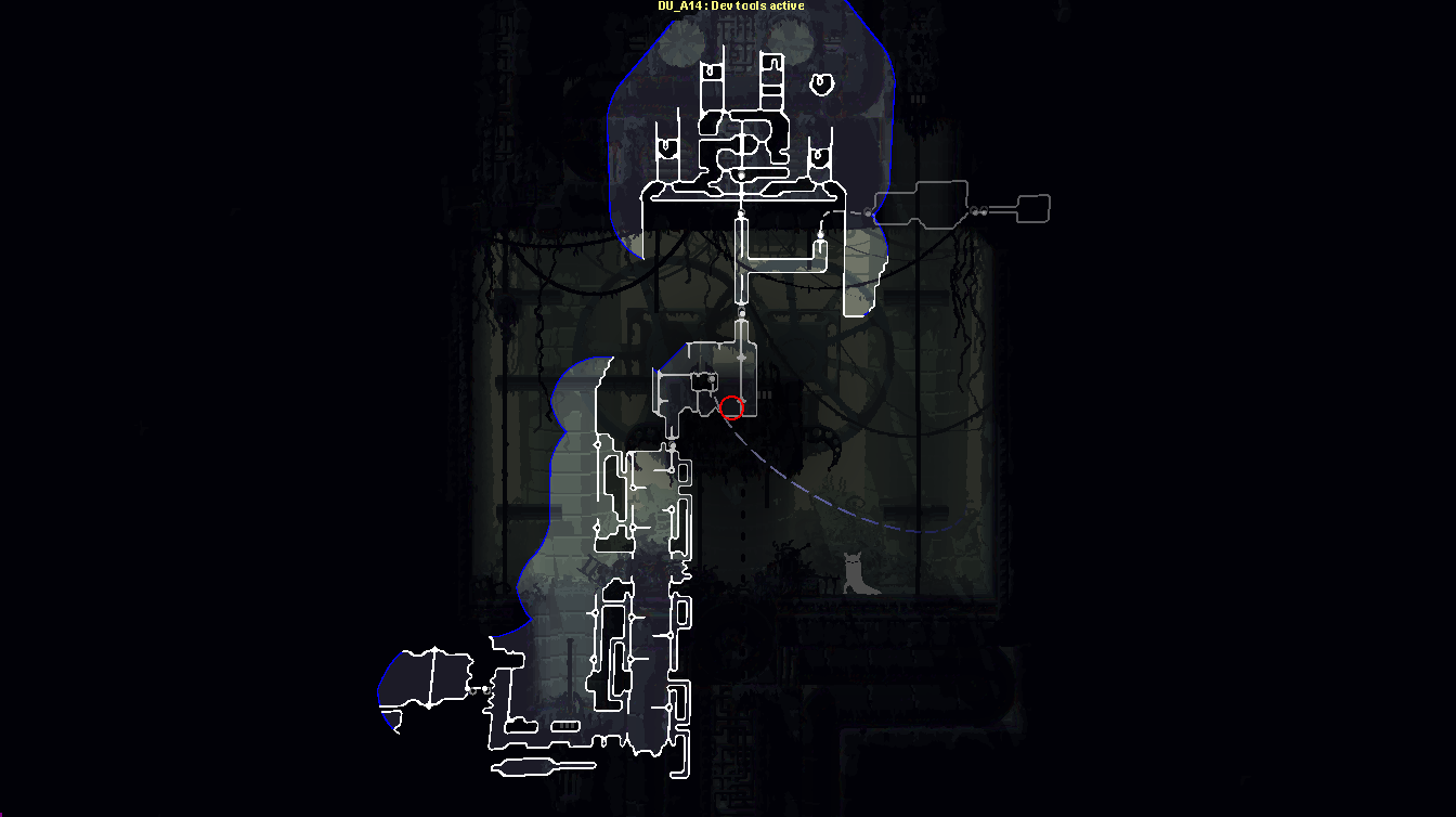
The "slow reveal" animation looks like this (on a fully explored map, it looks slightly different if you just have bits and pieces uncovered):
It's essentially a flood-fill out from the player's position. We implemented this for a few reasons.
One is that we want it to feel like you're accessing the slugcat's spatial memory rather than just bringing up a map on some HUD - the slugcat is an animal, not a cyborg super soldier. If it takes a bit of time, its communicated to the player that this is an act of thinking long and hard about what was where, not just "bringing up the map".
Another is that that the animation doubles as a time penalty. The idea is that the filling in animation should be somewhat satisfying and fun to watch, masking the penalty aspect from the player while the actual gameplay implications of it remain; namely that you spend precious seconds just standing still. Hopefully this will incentivize fewer and longer map sessions rather than quickly tabbing in and out of it once every room. We want the player to look at the game, not the HUD - if you flicker in and out of the map you don't pay as much attention to landmarks in the environment, and looking at the environment is exactly what we want you to do as much as possible. Also we want the player to have to keep at least
some of their route in their head, as that's part of the game's challenge.
A third one would be that your inability to move in combination with the enemy still being mobile will require you to find a good hiding spot for bringing the map up, which feels like a nice atmospheric element.
The flood fill has a bit of a bias towards where you're panning the map, so you can sort of "pull" it a bit in one direction or another. If you release the map button quickly, your map reveal progress is saved, but if you wait for too long or move around too much it's reset. There is some forgiveness though, if you take the map down and quickly move a few steps in some direction you can bring it up again without it being reset.
The blue color in the map signifies an edge of the explored area which is not a wall - basically somewhere you might potentially explore further. Not 100% settled on the aesthetic of that element just yet, but I think the functionality is sound, it makes a lot of sense that you should be able to easily browse for potential exploration destinations.
The dotted lines are, as I'm sure you've understood, longer connections between rooms.
These have been a bit of a problem in some of the earlier regions, that were developed when we thought of the rooms more as free entities rather than part of a whole that should make geographical sense. HI (pictured) is sort of on the edge of that paradigm shift. In the gif you can see that I first pan over a bunch of rooms that make a lot of geographical sense, but then I pan to the right and things get pretty jumbled with lots of dotted lines crossing over each other and the rooms they're connected to. That latter chaotic look is part of what we're going to try to tone down in the upcoming level work. A big majority of it seems to be solvable just by re-connecting the rooms, and where that doesn't work we'll add the occasional simple little connector room. Not all of the dotted lines will necessarily be eliminated though - personally I kind of like having a few of them spicing up the look of the map. The criss-crossy chaos in the rightmost part of this map however will be worked with a bit.
 —
— 


 These gifs were to show off a technical implementation, not the content of the map, which will make a big difference. A few notes that may address some of your concerns:
 Not gonna let you down!


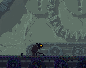
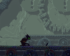
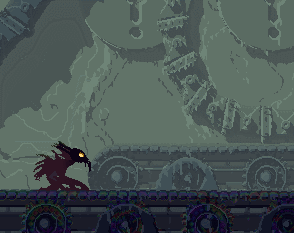
 It's not even possible to express the improvement this region has gone through in just a couple of days.