^^^ actually, i think Joar will *love* that you are making that connection!
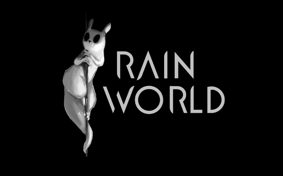
Thanks for opinions gentlemen! All will be considered. For the time being, it is water under the bridge though. As Joar mentioned, we had a tight deadline for this aspect, and assets have already been shipped for the purposes of this particular logo iteration. It will likely be revisited again when we get nearer to release and we have everything else set. We've had universal positive response to it outside of the devlog, the people less familiar with the project, so we'll look at this all with the long view a few months down the line and see how things feel

(Whats amusing for me is remembering how much everyone HATED the last logo, and the nightmare thread fires that happened around the creation of that. Now of course many people fondly remember it, haha. As always, change is bad.)
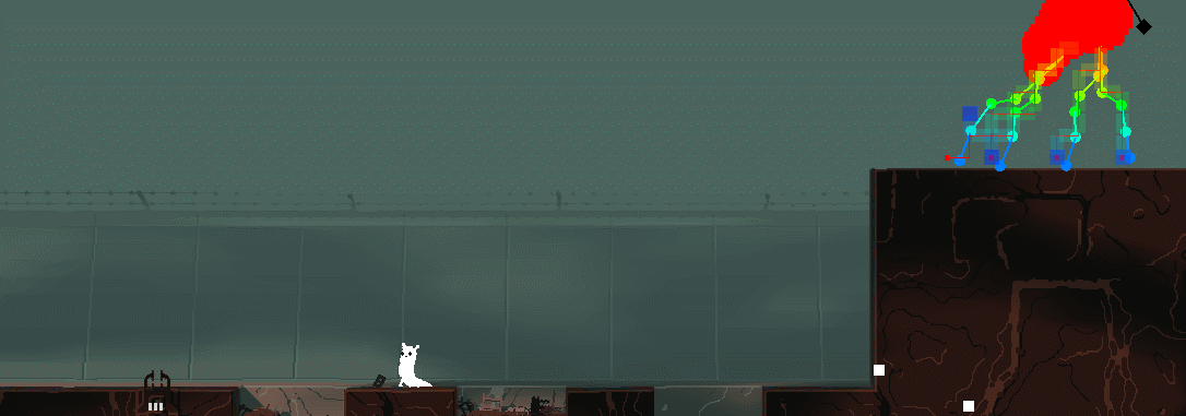
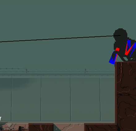
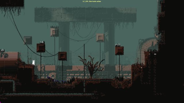
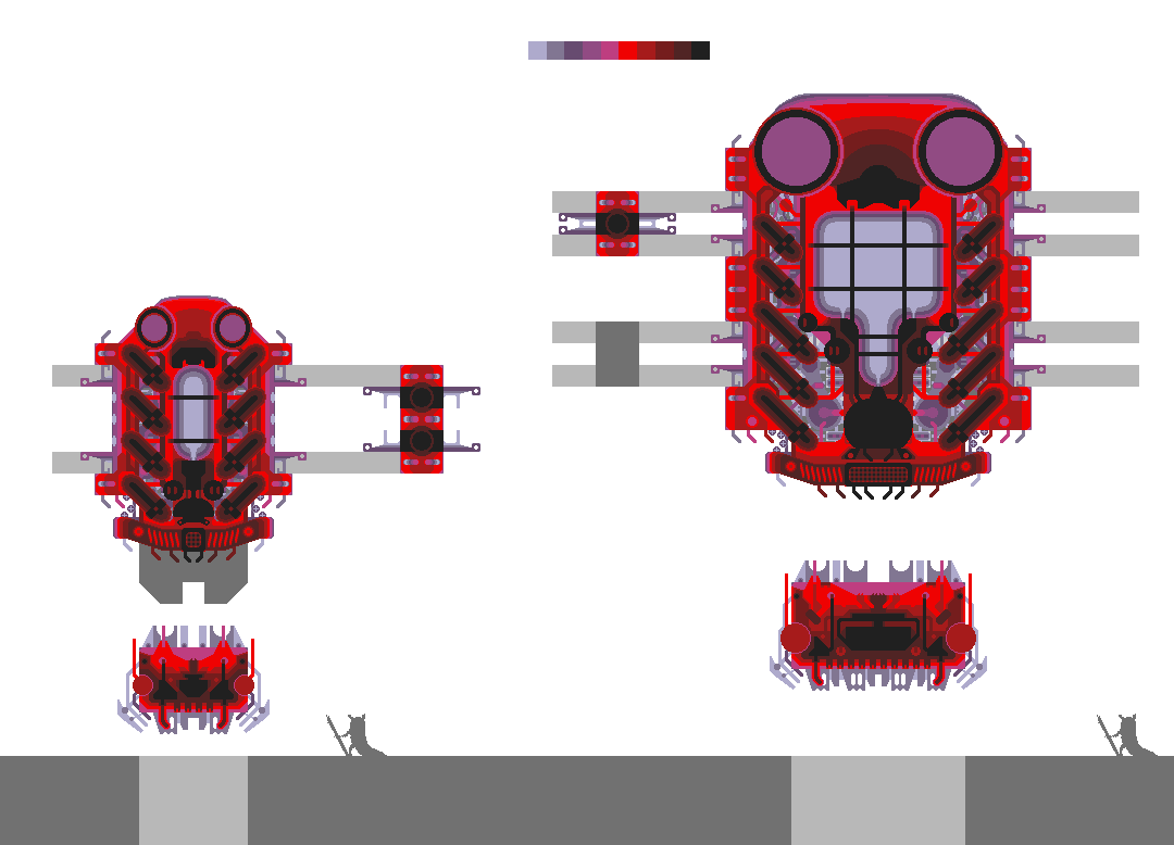
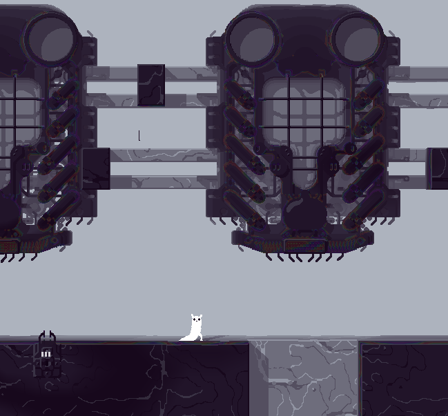
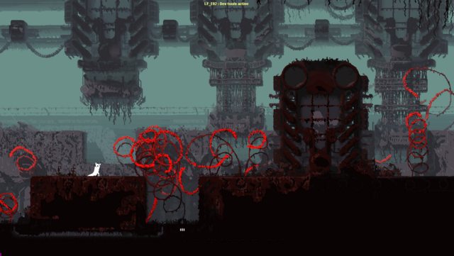
Anyway, moving on! We've got a lot of game to make, so have to keep on the grind. I was very much enjoying the posts of screenshots from The Mist and war of the worlds, etc, as inspiration for this new beast (nicknamed the Raindeer, yes yes we know.) As for the behavior and role, I dont want to spoil too much of course but as usual Christian and Teod have made some very close guesses.
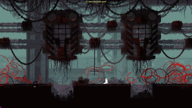
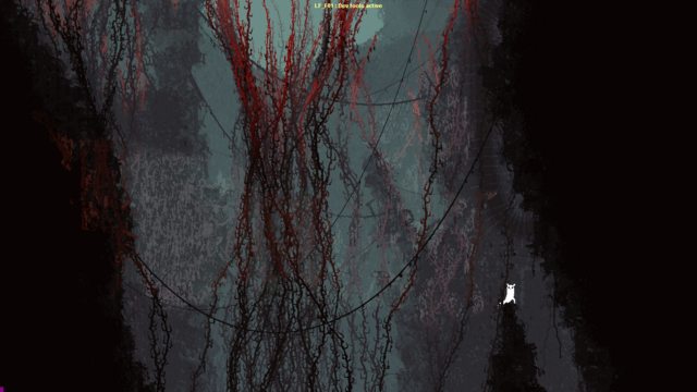
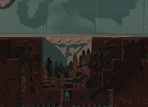
I havent been posting much recently, as most of the level stuff right now isnt so flashy. Im currently working on a subregion that connects Suburban to Linear Farms, so ive been experimenting with finding a gradation of the plainer, boxy "valley" SU style and assets with the more much detailed open horizon LF style:
detail:
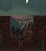
https://i.imgur.com/pUzLpvX.pngyou'll notice a liberal application of worm grass, which has quickly become my favorite rain world creature.

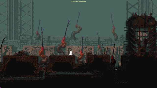
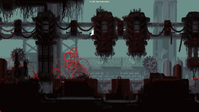
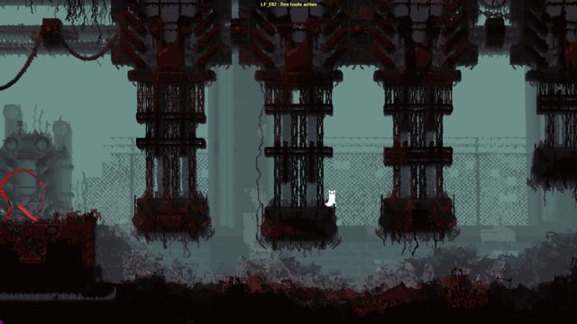
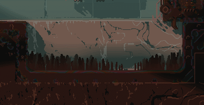
and other task is creating the wide stretches of crop farms:
detail:
https://i.imgur.com/r5990VA.pngnot terribly exciting, i know. that should change soon though, as new tiles are incoming.
We're probably a solid halfway through the region, but of course i want to wait to see how the Raindeer plays before going too much further with LF room geometries, as the rest of the terrain will be its turf.

 — Home
 In all seriousness tough, this shock value is sort of what I was going for - I trust James to introduce them gradually to make it fair for the player though.