Update 113What I should be doing right now (except from actual non-RW work) is adding a more decent main menu so that the Prince of Arcade guys won't bleed too much out of their eyes. It's hard though, because I don't know if I should start on the framework for the final main menu (and waste time making way for things that won't be used this time around) or if I should go for a quick fix (and waste time doing stuff that won't make it into the final game). Realistically I think I'll settle on changing the colors a little for the cascade of ugliness that's the main menu right now.
This is however not what I'm actually doing. I've been wrestling Macromedia Director's very 90's-ish code solutions once again today. A sound can have a "loop back here"-marker set in it, but the point from which you
start playing the sound can't be set behind that point. This means that my plan, to have a song start playing at a random place and once it reached the end start over from the very beginning, was a no-go. This wasn't good, as a custom game session is shorter than the average song, meaning that there would be a lot of musical material that would never be heard.
I managed to fix it though, with a small hiccup in the looping. Maybe I'll get around to doing it differently for songs that actually start playing from the beginning, so that they won't suffer from the hiccup. Minimize the damages.
Ah well, it's sunday, I might as well make this a long post.
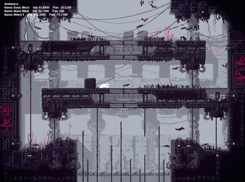
So, yesterday I made a small change to the level renderer that in turn made a small change to the level art. Very small, but I find it enjoyable.
Here, look:
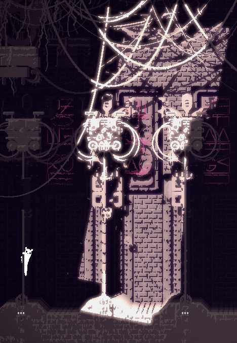
Can't spot the difference? Try putting them in different tabs and switching between them. Here they are, overlayed:
The "earthquake" effect is because the second image is slightly scewed. I got tired of having everything completely straight and square, it seemed lifeless. But the problem was that I couldn't tilt or scew anything, because the game was mathematically built around a perfectly straight grid. The collision boxes of things would still be straight, even if the level was tilted.
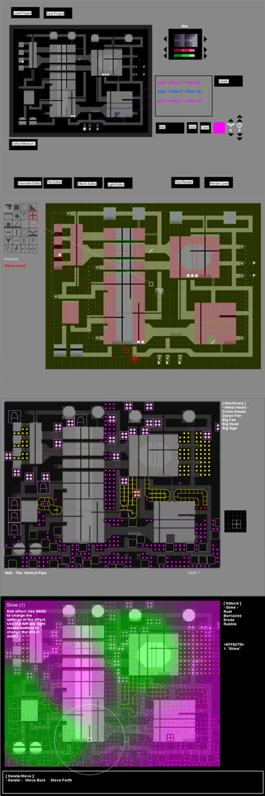
The solution I found was this :
The level is rendered as 30 layers, and the objects of the game are drawn in layer 5. By having a "scewing factor" that increases as you move away from layer 5, but is fixed at 0 on layer 5 itself, it's possible to scew the background and foreground while keeping the actual gameplay relevant graphics in phase with their hitboxes.
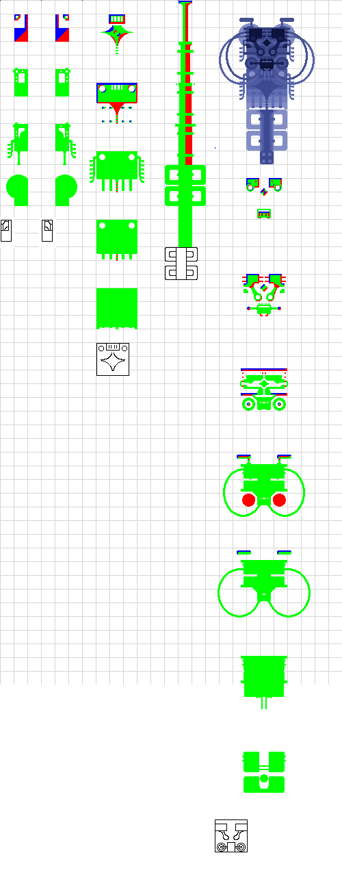
I know the effect is very slight - I want it that way. When trying stuff out I made some renderings that made your truly sea sick, like this:
But I decided to keep it subtle. Maybe a little too subtle, now when I look at them I think I'll have a little more scewing in there after all... I'll settle on something. The point is that now everything isn't perfectly lined up, and just seeing a slight difference in angle between two things make the environments seem a little less artificial.
I guess I'm trying to strike a fine balance with the art. In one way I want it to look a little tile-ey, and not just like one big drawing made by hand. Not because I don't like hand drawn aesthetics, but because it has been done so many times before.
On the other hand I want one specific feature of the hand drawn aesthetic - the uniting of the graphics into one single image. Tiles tend to look like... tiles, different pieces that fit more or less well together. Reality - especially when dirty and worn down - tends to blend into one in a way that correlates more closely to the hand drawing than to tiles. But the drawing has certain quirks as well, such as some lines looking different than others because the drawing tool is held in one hand and not the other.
I want to have the cake and eat it. My goal is to create an aesthetic that looks like one unified image, but doesn't have the characteristics of the human hand. That's why I have this combination of tiles and effects going on. The tiles look technical and strict, while the effects make it look a little dirtier, and more importantly unifies it into one single image. What I want, after all, is to create images of worn down machines. I couldn't do without either the strict or the dirty.
On top of this comes another factor - the stylization. The game is - in a way - pixel art, with everything that comes with that art direction. One of those things is tiles. At the same time the game is not strictly classical pixel art, it's a
subversion of sorts. I want to play with the pixel art aesthetic, but I don't want to play it straight. This is for example why the characters are kind of looking like pixel art, but not
moving like pixel art usually does. I want the same thing for the environments - something that's a wink to the classical pixel art genre, and something that's different.
I like to think of my game as a pixel art
rendering of a world that is not a "pixel art kind of world".
The tiles are more in line with the pixel art tradition, while the effects and the scewing are something else. It's a hard line to strike, because if I get too happy about adding stuff I might go too far in one direction or the other. This is for example why I use blur in the graphics, but use it sparesly. If I just went ahead I would lose the aesthetic I'm aiming for.
So, in conclusion, now I have another factor to fine tune in this balance act!


 —
— 


